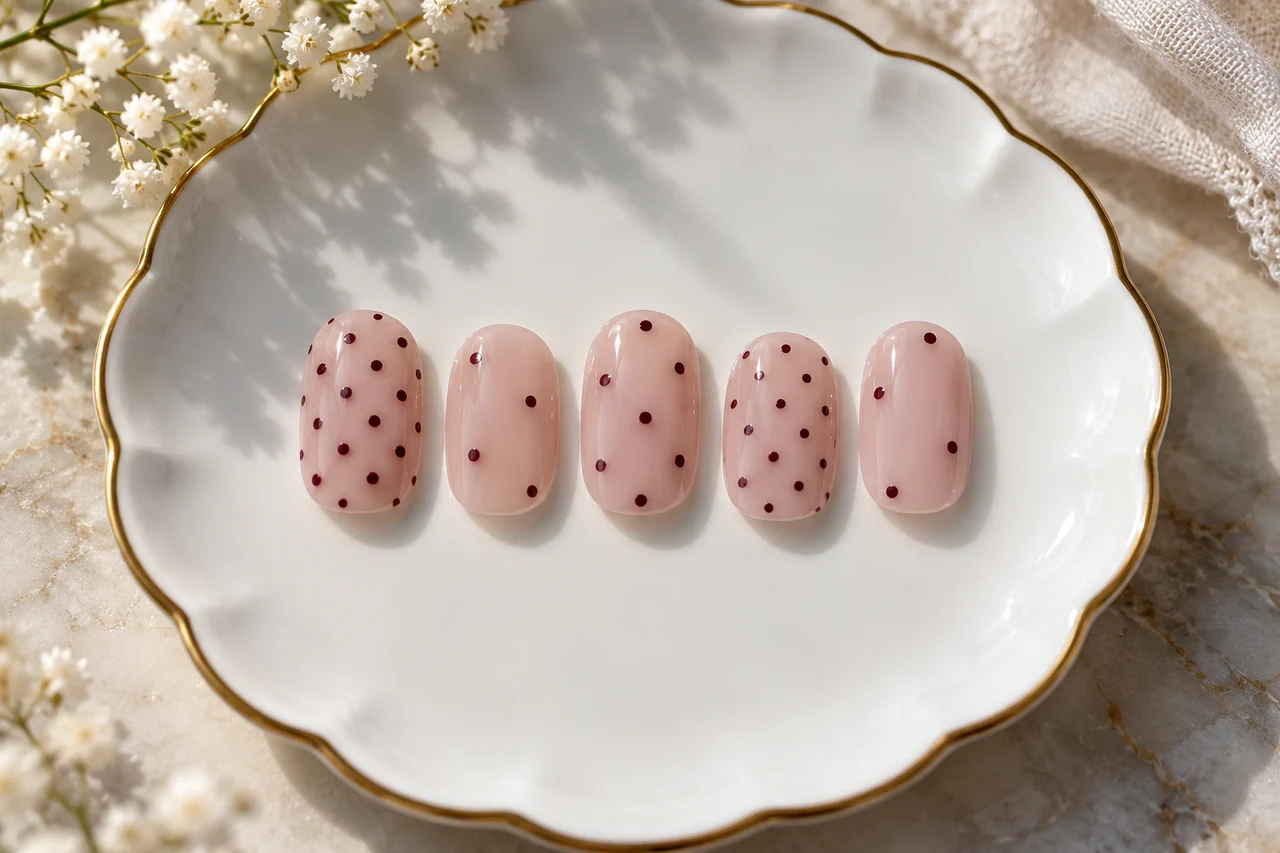
Dots are easy to recognise, but their size, spacing and colour change the effect. Begin on paper with your actual nail proportions and a small colour selection.
Start with the smallest surface
Sketch the little-finger nail and add just three dots. At ordinary reading distance, can you distinguish them or do they merge into a patch? Add more only after checking. A design visible only under strong magnification may not meet your goal. On the thumb, use more space or another row rather than automatically enlarging every dot.
Choose a grid or a loose scatter
Draw both with the same number of dots. Imagined guide lines can help an offset-row pattern. For a scatter, place a few main dots, then assess gaps instead of filling every empty space. If you like deliberate irregularity, keep colour or approximate dot size consistent so a repeated idea remains visible.
Change size and contrast separately
Dark dots on a light base stand out more than similar rose shades together. If the pattern feels too strong, first change either size or colour, not both. You might like large dots with softer contrast or a black-and-white effect using less area. A single change reveals whether density, contrast or their combination is the issue.
Compare three clear designs
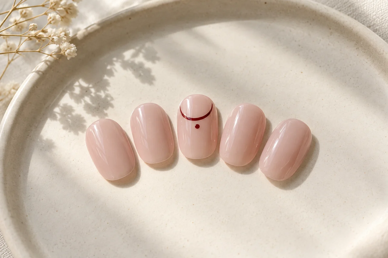
Sketch three dots in a line, widely spaced offset rows and one larger accent dot. The line gives direction, the grid gives repetition and the single dot acts as a sign. Compare beside a ring or frequently worn pattern. The least detailed version may complement an already busy outfit best; technical difficulty is not a quality ranking.
Practise with suitable products
For ordinary-polish practice, use intended cosmetic products and tools as directed. Test the dot size made by your tool on a suitable sample surface first. A repeatable action is more useful than endlessly adding colour to make one dot perfectly circular. A looser scatter can suit your skill better than rigid rows. Do not substitute household paint, craft glue or loose decorations for intended nail products.
Plan both hands and review specifically
Draw ten outlines and choose all-over dots, a few accent nails or one dot on each. The ring finger is not compulsory. Different distributions can belong together through the same colour and idea.
After wearing the design, ask whether the dots were visible enough, whether the whole-hand distribution suited you and whether contrast worked with your clothes. Replace a vague “too busy” with a specific observation: too many dots, too many colours or too little space. Change that feature next time and keep the sketch for a reliable comparison.
Frequently asked questions
What is the correct dot size?
There is no universal ideal. Compare at least two sizes on an outline matching your available surface. Dots should remain distinct from your intended viewing distance.
Must a polka-dot pattern be symmetrical?
No. A loose scatter can be deliberate. A shared colour and approximate dot size can connect it without exact geometry.
How do I prevent a crowded effect?
First reduce the number of dots or patterned nails. That is usually a clearer change than introducing another colour.

Questions and experiences
Share a question or a useful experience about this topic. Every contribution is checked before publication. Comments may be written in different languages.
Loading reader contributions…
Opening the form sets a necessary session cookie. No email address is required. Publication is subject to moderation and is not guaranteed. For deletion requests: Contact