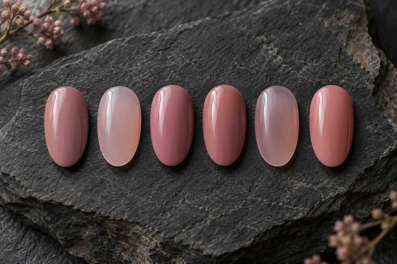
Nude is not one colour. A pale rosy shade may be quiet on one hand and strongly contrasting on another, and either can be intentional. Separate lightness, colour direction and coverage to choose your own effect.
Describe the result precisely
Write “a sheer rosy tint” or “a quiet opaque brown-beige surface” instead of only natural. Decide whether the free edge should remain visible or whether you want an even coloured background. Both may feel restrained. A difference from surrounding skin need not be corrected: choose a soft transition or a deliberately lighter or darker accent before comparing shades.
Compare coverage first
Use two samples with similar colour direction but different opacity. Notice the natural edge and colour beneath. A sheer version need not gain more layers merely because it covers less than an opaque one. If visibility bothers you, choose a formula intended to cover more. Follow the product’s application rather than inventing a universal layer count.
Separate hue from lightness
At similar lightness, compare rosy, beige, mauve and brown directions. Then try a lighter or darker version of the preferred family. Jumping from very pale rose to deep brown changes several features at once. A gradual comparison clarifies whether you mainly want another hue or another contrast. A product name does not establish its match to your skin.
Give different neutrals different roles
A very sheer tint, an opaque skin-adjacent colour and a deliberate neutral contrast can all have a place. You need not declare one the only correct nude. Place samples beside your hand with usual jewellery. Ask whether you like the visible edge, the transition beside skin or the chosen degree of lighter-dark contrast.
Keep lighting comparable
Begin in even daylight with the same background, then inspect favourites under normal indoor light. Strongly coloured sleeves and changing photo lights can alter perception. This is practical comparison, not a scientific skin test. A phone image is a memory aid rather than exact colour reproduction; add notes such as too rosy or opaque and intentionally lighter.
Buy for a gap and brief clearly
Sort existing polishes by sheer tint, quiet opacity and clear contrast. Two similar rosy shades may already exist while the wanted coverage is missing. Ask for a real sample or dependable product description rather than buying a whole collection. Higher price alone does not establish a preferred hue or transparency.
A precise salon request might be “short nails, opaque medium brown-beige, intentionally a little lighter than my skin, glossy and plain”, or “sheer rose with the free edge visible”. Compare two samples and change only the unwanted feature after a trial.
Frequently asked questions
Is nude always pale beige?
No. The term covers varied neutral and skin-adjacent directions. Your desired lightness, coverage and contrast with your own hand determine the choice.
Must polish match my skin exactly?
No. A soft transition or a visible difference can both be deliberate. A lighter or darker neutral is not automatically the wrong shade.
Why does the colour look different in the bottle?
Background, application and light contribute to the result. Particularly with sheer products, compare suitable real samples under similar conditions.
Questions and experiences
Share a question or a useful experience about this topic. Every contribution is checked before publication. Comments may be written in different languages.
Loading reader contributions…
Opening the form sets a necessary session cookie. No email address is required. Publication is subject to moderation and is not guaranteed. For deletion requests: Contact