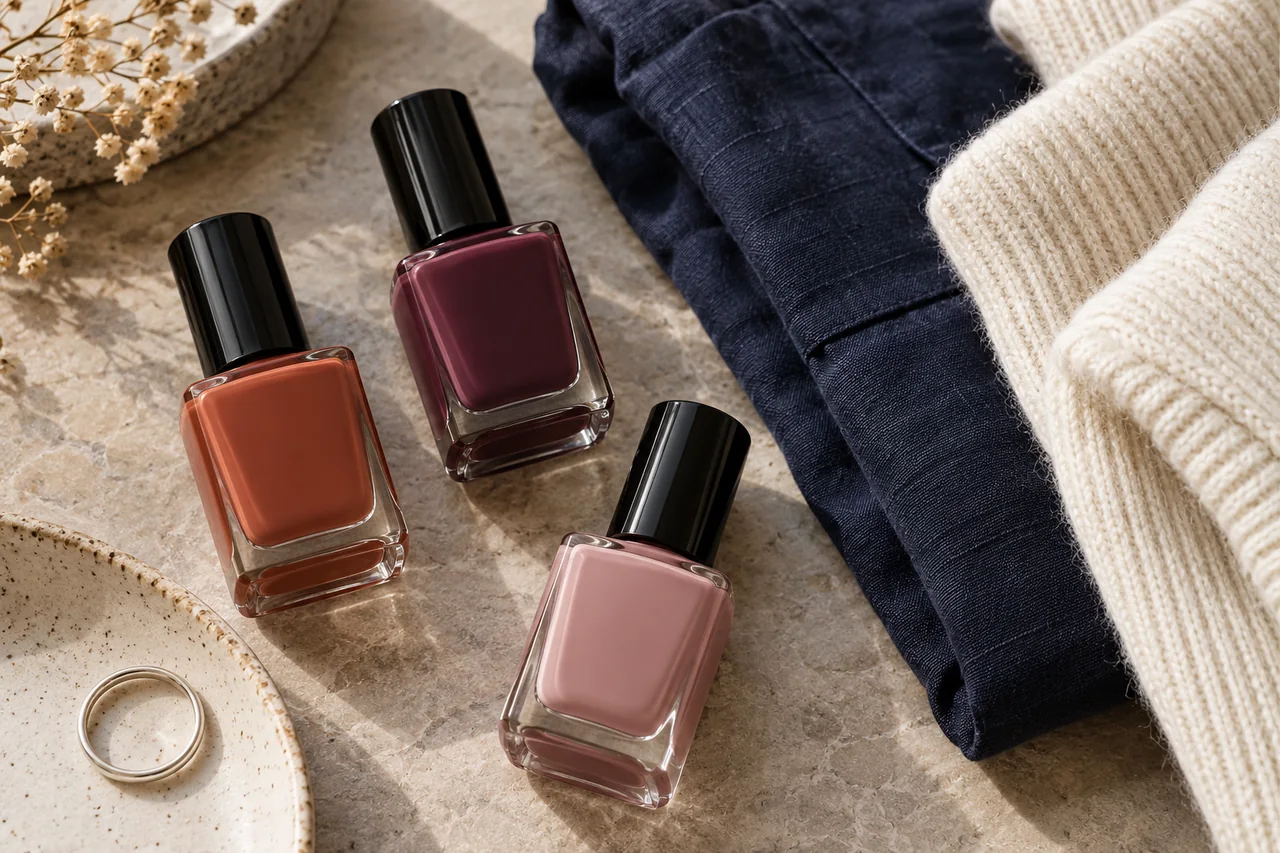
Your everyday wardrobe is a better starting point for a useful nail-colour palette than a collection of aspirational pictures. Decide what role the colour should play.
Select three real outfits
Lay out combinations from an ordinary week, including tops, jackets or scarves visible near your hands. A rarely worn evening outfit need not determine the everyday palette. Note large colour areas and recurring details: perhaps navy, cream and warm brown, or a colourful wardrobe that you want calmer nails to accompany. No seasonal colour category is required.
Choose the role of the colour
A repeating shade picks up an outfit colour; a connecting shade links several recurring tones; a contrasting shade creates a deliberate point of difference. These are design options, not quality rankings. Berry polish may repeat a pink pattern and act as an accent with a plain blue jumper. Ask what the colour does in the combination rather than only whether it matches.
Compare samples beside fabric
Use painted samples or a product sample in reasonably neutral daylight. The bottle alone gives limited information about final opacity. Hold each sample beside the same fabrics, then beside your hand. Warm artificial light and screen brightness can change the impression. Note specifics, such as “cooler beside cream” or “repeats the red detail”; these observations help with future choices.
Include your usual jewellery
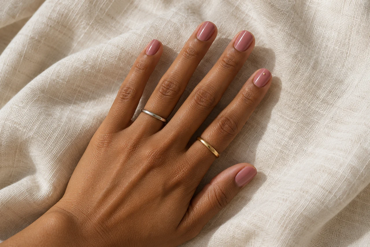
Rings and bracelets influence the overall effect, but polish need not share their warmth or shine. Try familiar pieces with the shortlisted colours. Calm nail colour may suit mixed jewellery; a stronger shade can lead beside simple rings. If colour, pattern, metal shine and stones all compete more than you intended, reduce one element rather than rejecting the whole combination.
Give the palette three useful jobs
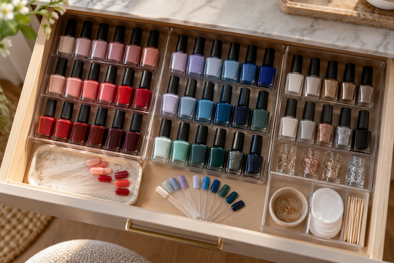
Choose an easy everyday option, a more visible colour and, optionally, an occasion look. These need not mean three purchases: one existing polish may cover several jobs. Name two actual outfits for each candidate. Set aside shades with no intended use for now. Very similar pinks may add less variety than an existing pink and a different finish.
Review the combination after wearing it
For a navy, cream and rust wardrobe, you might compare muted rose, warm red and dark plum with the same clothes. These are suggestions, not colour laws; a cool-warm contrast may be exactly what you like. You do not need a theoretical contrast shade you rarely want to wear.
After wearing a colour, distinguish hue, opacity and finish when reviewing it. Perhaps strong shine, rather than the shade, felt wrong beside matte fabric. A private photograph can remind you of a successful overall effect without being an exact colour measurement. Reconsider the palette when your wardrobe changes, not whenever a trend acquires a new name.
Frequently asked questions
Must nail polish match shoes?
No. Repeating a colour is optional. Consider what is visible together and which detail should attract attention. Calm polish or a deliberate contrast can both work with statement shoes.
Is nude always the safest choice?
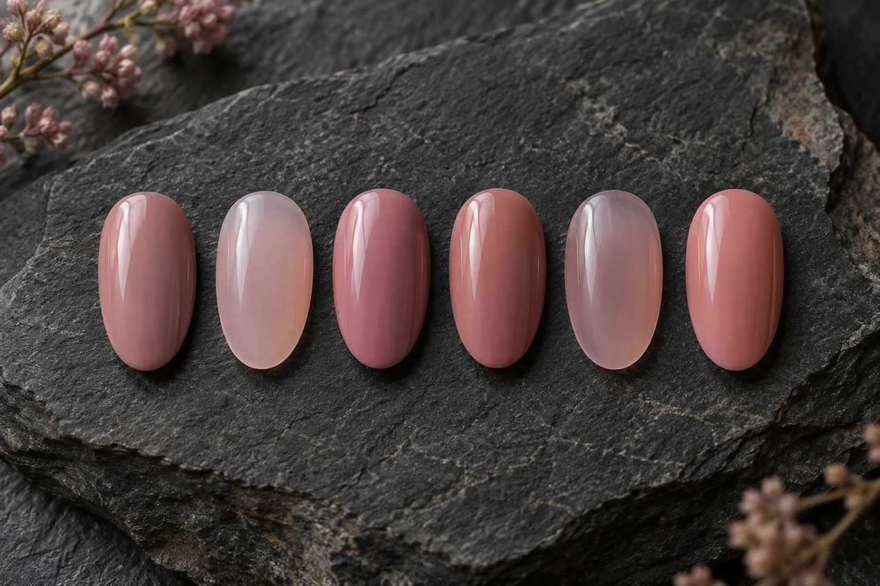
Nude describes many shades with different lightness, undertones and opacity. A sheer rose and an opaque beige can look very different beside the same clothes. Compare actual samples.
Questions and experiences
Share a question or a useful experience about this topic. Every contribution is checked before publication. Comments may be written in different languages.
Loading reader contributions…
Opening the form sets a necessary session cookie. No email address is required. Publication is subject to moderation and is not guaranteed. For deletion requests: Contact