
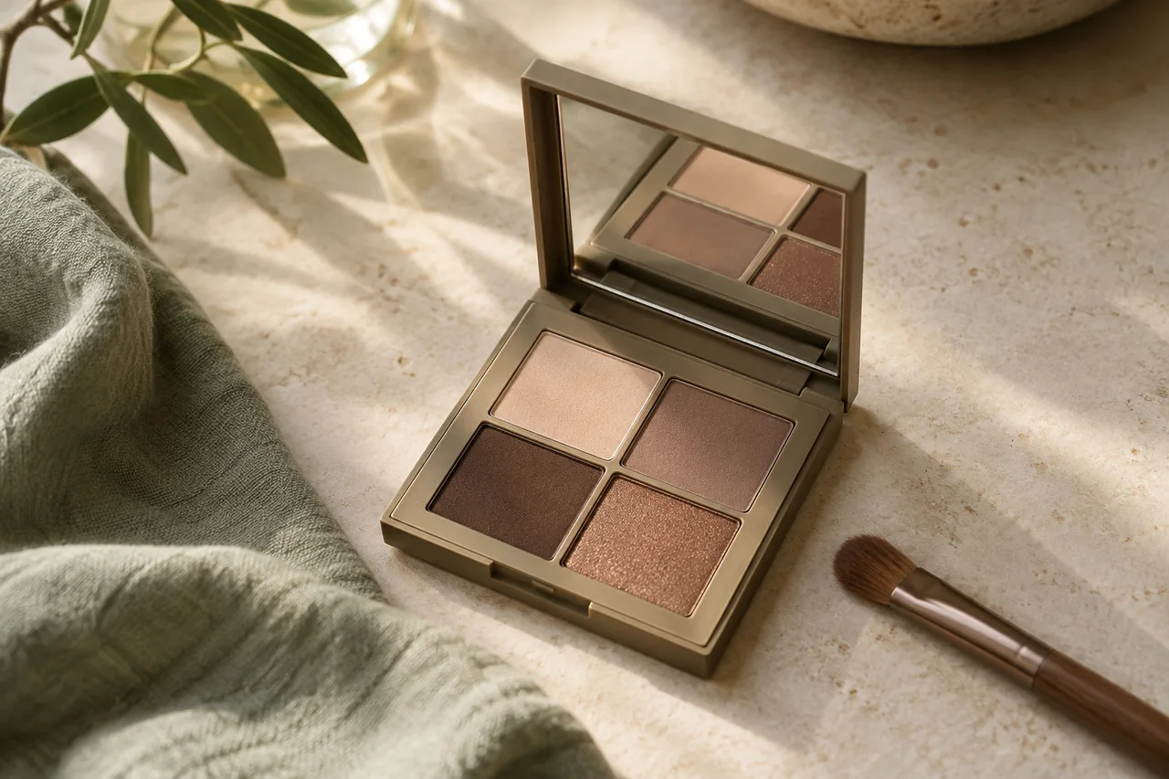
Warm brown is often suggested for blue eyes, but it is an option rather than a compulsory contrasting colour. Taupe, grey, blue and other favourites also belong in your choices. Compare colour and finish separately, using a manageable application.
Establish a reference
Try a familiar taupe, brown or another favourite on a small area. With eyes open, note whether it creates a soft patch or a clearer line. You need not cover the whole lid. A repeatable placement lets you compare a new colour without changing the shape at the same time.
Explore copper carefully
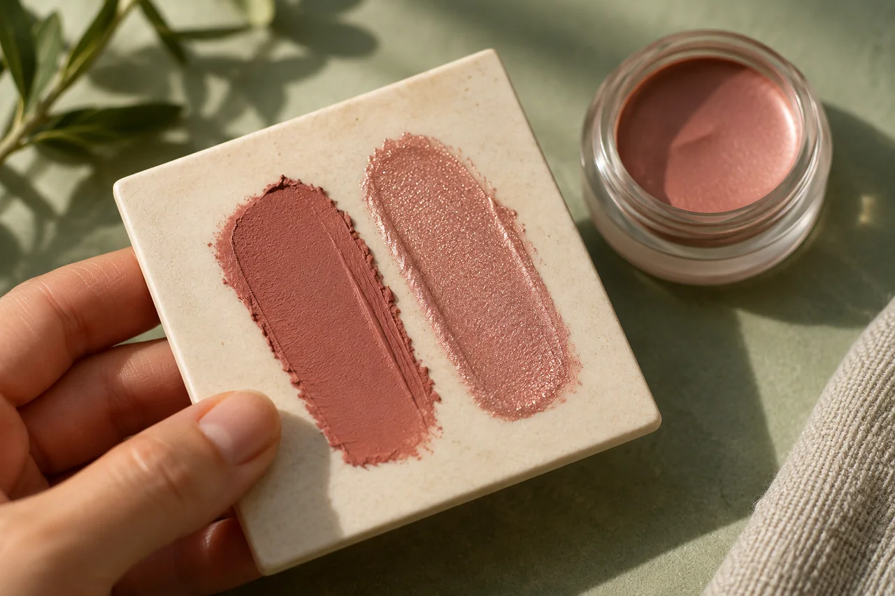
Copper ranges from reddish through orange-brown to bronze, in matte, satin or metallic finishes. To compare warmth, keep the finish reasonably similar to your reference. Use comparable light and the same lip colour. If it feels too strong, reduce the area or try a muted shade. Making the iris as conspicuous as possible is not a requirement.
Allow blue into the choice
A grey-blue can repeat a colour direction or act as its own accent. A clearer blue may suit you better if you already enjoy strong colour. It need not match the iris or a blue collar exactly. The old rule against matching shadow and eye colour needlessly removes possibilities.
Test in everyday surroundings
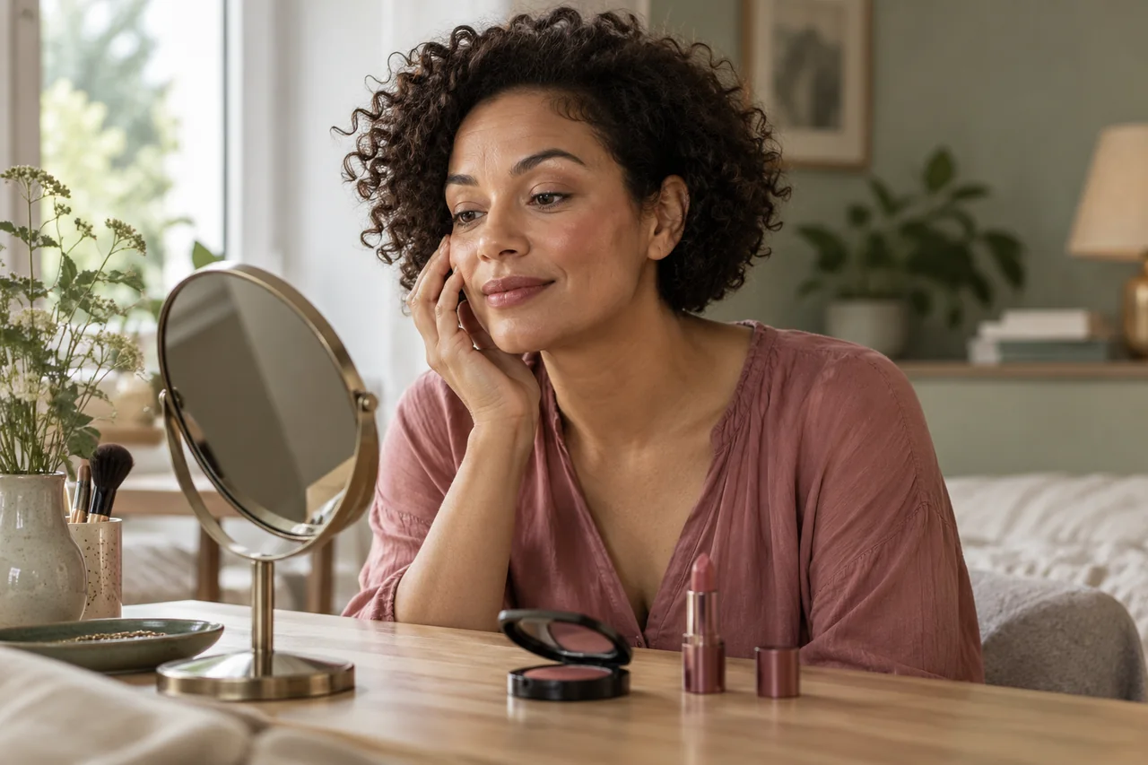
Wear the colour normally and view it from ordinary mirror distance, with your usual glasses. Compare window light with the indoor lighting you actually use. A photo can remind you of the combination, but automatic camera adjustments are not a neutral colour assessment.
Keep application comfortable
Use only cosmetics intended for the eyes. The FDA advises stopping if irritation occurs and seeking medical advice if it persists. Note which options feel quiet, bold or playful. Taupe and one blue may already be enough; add copper only if you want that warm direction, rather than because a large palette seems the next obligatory step.
Frequently asked questions
Must I wear orange with blue eyes?
No. Orange or copper can provide contrast, but taupe, grey, blue and other favourite shades are equally valid starting points.
Is grey automatically too cool?
No. Depth, placement and your desired result matter. Try a smaller area or softer taupe if grey feels stronger than you want.
Questions and experiences
Share a question or a useful experience about this topic. Every contribution is checked before publication. Comments may be written in different languages.
Loading reader contributions…
Opening the form sets a necessary session cookie. No email address is required. Publication is subject to moderation and is not guaranteed. For deletion requests: Contact