
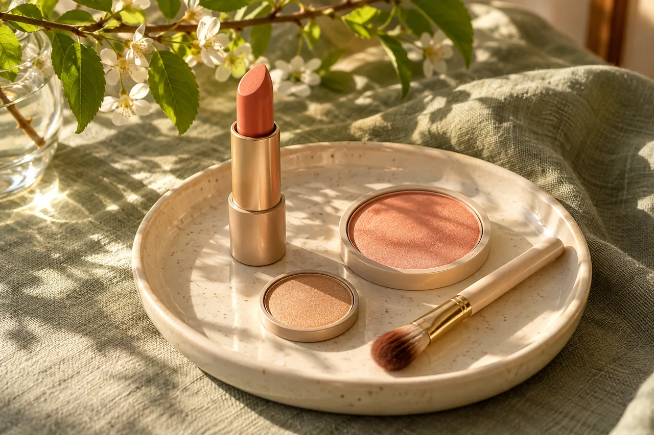
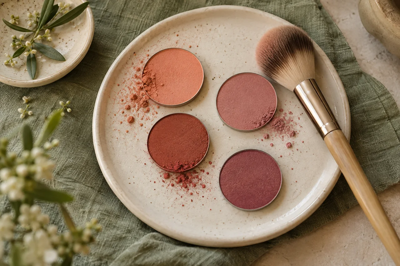
Coral covers a wide range between pink, orange and red. A sheer coral and an opaque coral may feel entirely different. Start with one existing lip or cheek product; you need neither a seasonal colour label nor a new summer collection.
Pink or orange?
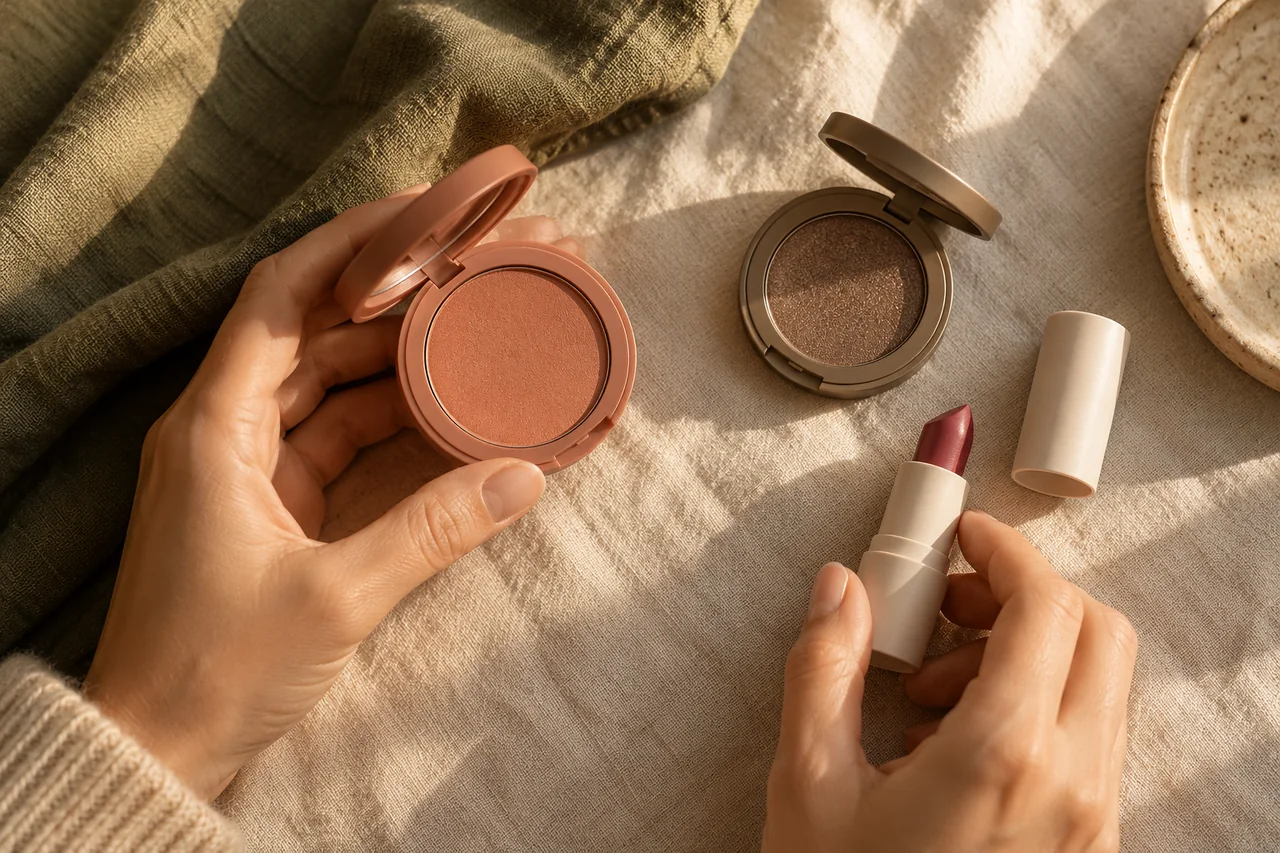
Compare two warm shades of similar depth and coverage. A pale balm and opaque orange-red change too many things at once. Try one lip accent with your usual cheeks, or change the blush while keeping your lips familiar. Describe the difference: more colour, a softer connection or stronger contrast with clothing.
Check the base as well as the shade
A pale opaque coral can look like a light patch on deeper skin; a deeper or more transparent version may produce a softer result. On light skin, the deeper colour may become a deliberate accent. Start lightly and assess from conversation distance. Less product can solve excess intensity, but more blending cannot remove an unsuitable pale base.
Give lips and cheeks different roles
Related coral shades need not match exactly because skin, lips, texture and quantity change their appearance. Try stronger lips with quieter cheeks, then reverse the emphasis. Only use one product in several areas if its instructions explicitly allow this; a shared colour name is not a safety instruction.
Try three outfits
Compare the accent with cream, navy and an existing green garment. Notice whether you prefer a pinker coral with sage or a stronger orange contrast. Record the whole outfit. Bags, jewellery and nails do not all need to repeat the colour.
Make it useful beyond summer
Try coral with knitwear and dark jackets in ordinary lighting. Wear it on a normal day before adding another texture. One blush and one lip product may already offer enough variety; an addition should have a role you will actually use.
Frequently asked questions
Can coral work with cool clothes?
Yes. It can create deliberate contrast with grey-blue or navy. Judge the full combination rather than separating all warm and cool colours.
Are apricot and coral the same?
Retail terms overlap and are not standardised. Apricot often describes a lighter, yellower shade, and coral a pink-orange one; look at the actual product.
Questions and experiences
Share a question or a useful experience about this topic. Every contribution is checked before publication. Comments may be written in different languages.
Loading reader contributions…
Opening the form sets a necessary session cookie. No email address is required. Publication is subject to moderation and is not guaranteed. For deletion requests: Contact